
U.S. Department of Agriculture
Project Management Dashboard
Internship
Timeline
Aug 2024-April 2025
My Role
UX Designer
Developer
Team
Economic Research Services
Information Services Department
Tools Used
Figma
PowerBi
The challenge was to create a system that could track project managers' progress and their advancement toward project completion. I worked closely with Nsenga Robinson, Chief Information Officer, to ensure the system complied with USDA accessibility protocols. My responsibilities included both designing and programming components of the dashboard's tracking functionality.
I presented our solution to project managers, highlighting how the new system would replace the need for a weekly status meeting. As a result, we eliminated a recurring one-hour meeting, streamlining communication and improving team efficiency.
Background
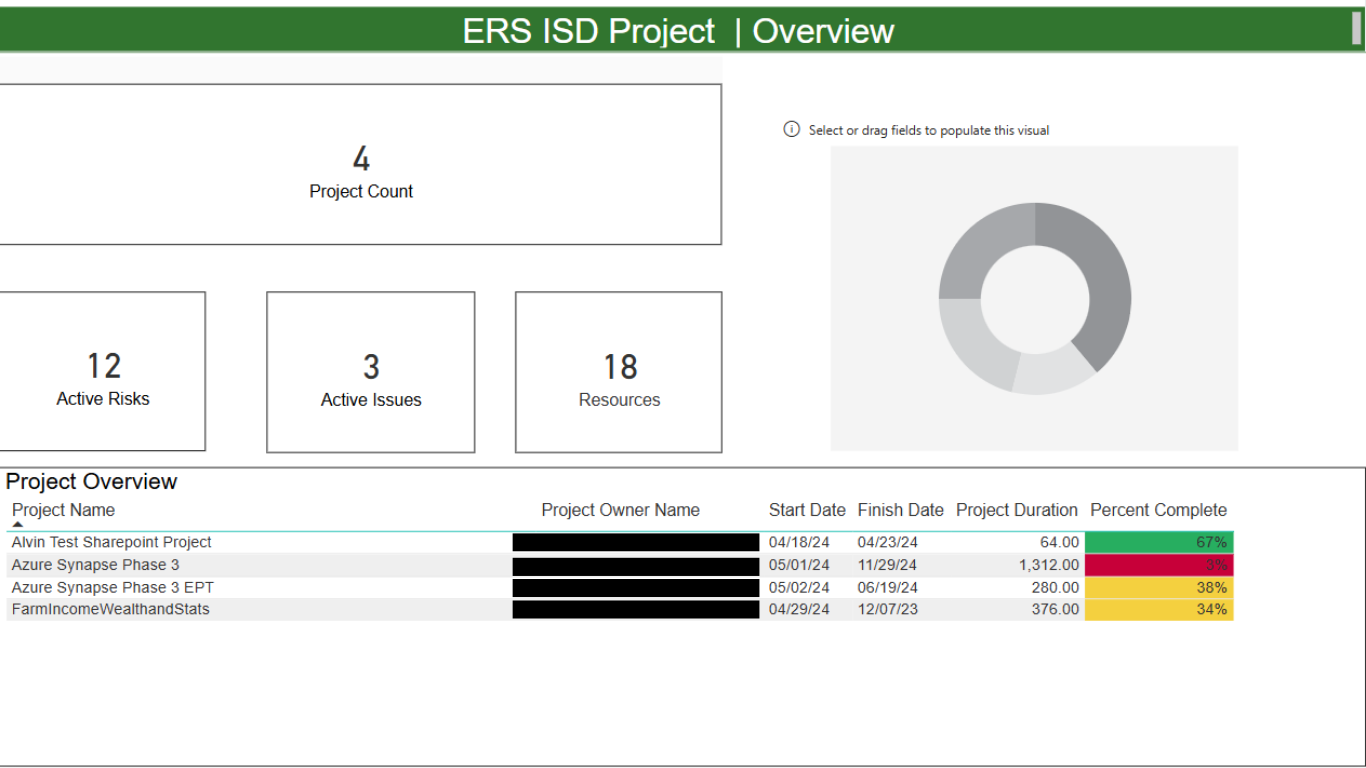
Image of the Dashboard Before
Because the technology was new and unfamiliar to most users, I was tasked with developing a modern, flexible solution that would replace the outdated PDF format. The goal was to create a tool that could remain current and adaptable over time.
The final product was presented to a team of over 30 project managers, with the goal of securing this tool as the primary system for tracking project progress.
The Challenge
Example Settings:
Remote project teams
Cross-departmental collaboration environments
Focus Areas:
Tracking project progress and milestone completion
Identifying communication gaps across distributed teams
Monitoring task ownership and accountability
Use Cases
Project Managers
Example Settings:
Government websites
Internal tools used by employees with accessibility needs
Focus Areas:
Ensuring content is accessible to users with visual and cognitive impairments
Improving clarity, readability, and navigability of digital systems
Visually Impaired Users
Project Managers Use Case: I observed weekly Zoom meetings and participated in relevant sessions to understand how project managers track and report progress. This gave me insight into communication gaps and inefficiencies common in remote collaboration.
I also reviewed best practices from the Agricultural Research Service (ARS), focusing on how they use internal trackers to monitor employee progress across projects. These findings helped shape a system that prioritizes key metrics like update timestamps and milestone deadlines to better capture overall project health.
Visually Impaired Users Case: I read case studies and reports on how users with accommodations navigate digital platforms, especially within U.S. government agencies, where accessibility is a legal requirement before site publication. I also examined past cases where poor system design prevented users from accessing or understanding key information.
To inform my design, I reviewed WCAG guidelines, consulted with an accessibility specialist, and interviewed color-blind and low-vision employees. These insights helped me design a system that ensures all users (regardless of ability) can access and interact with the interface effectively.
Research
To better understand user flows and pain points, I created storyboards for each key scenario a project manager would encounter while tracking project progress. Each storyboard was designed to highlight specific user goals, common frustrations, and opportunities within a collaborative project setting involving programmers and data scientists.
The visuals helped bridge communication between technical and non-technical stakeholders by illustrating how the product could support their need to maintain a healthy, “green status” project. Creating storyboards early in the process also helped validate key assumptions and informed design decisions before moving into prototyping.
Storyboard
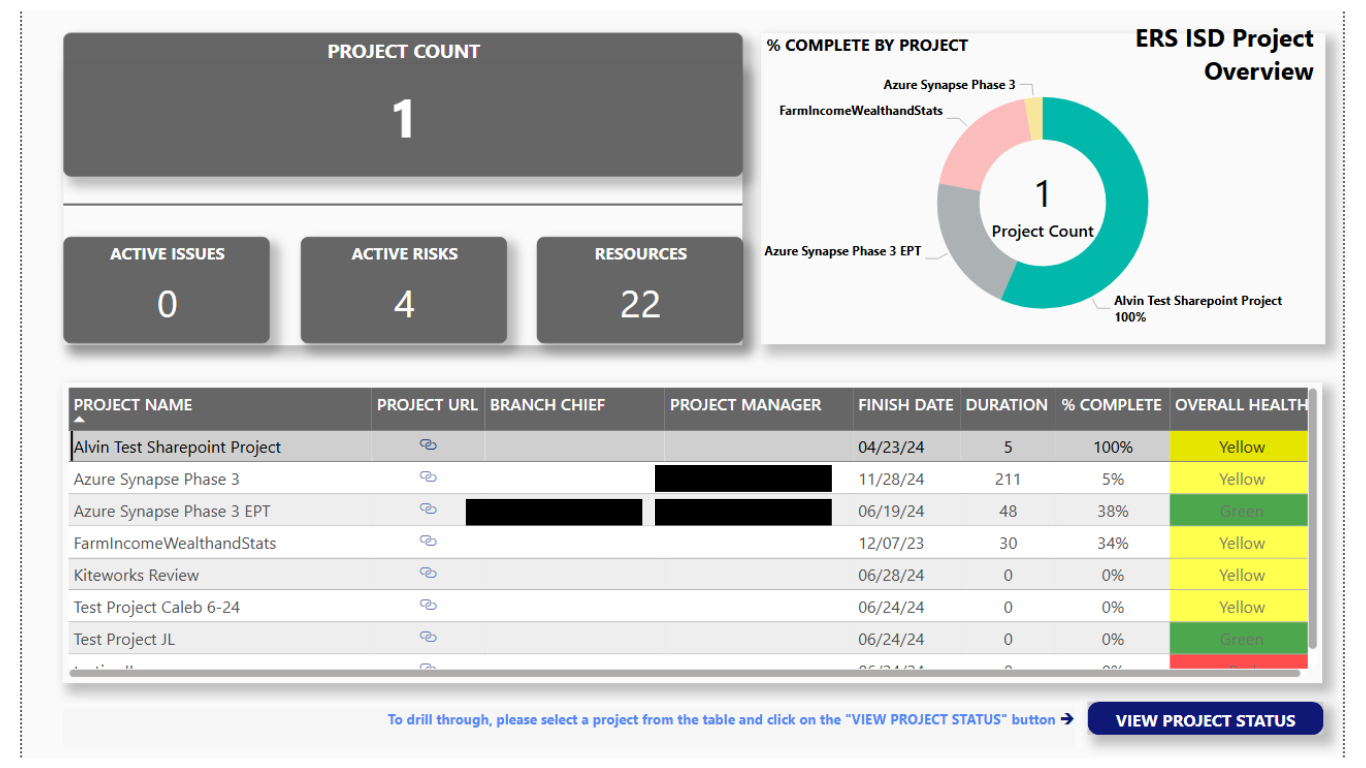
During a typical workweek, this tool helps teams stay aligned by clearly showing which tasks are active, closed, or postponed. Users can also view completed milestones and past accomplishments, helping them stay informed on project progress.
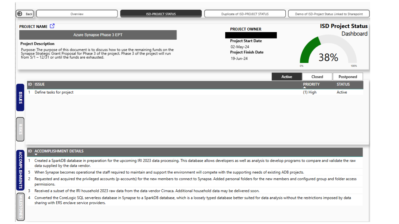
A project manager logs into the dashboard to check on their project's status and overall health. The system automatically highlights overdue tasks, allowing leadership to quickly identify which projects may require additional support.
The final designs were presented to a group of 30 project managers and division leaders, focusing on how their weekly meetings could be restructured using the new tool. I shared annotated mockups that demonstrated each feature and its alignment with real user needs.
The walkthrough created space for open discussion, allowing stakeholders to ask questions, provide feedback, and envision how the system would fit into their daily workflows. As a result, we received approval to move forward with transitioning from hour-long weekly meetings to a more efficient 15-minute round-robin format.